Product Design | Born-Digital Scholarship
Bring multiple asset types together (custom cartography, photography, and text) into a cross-referenced and integrated user experience showcasing the cultural history of the Grand Canyon.
The Challenge
I threw myself into a challenge posed by the director of Stanford University Press: create scholarship that is born-digital and takes full advantage of the experiential affordances of the web. The primary question is “what mediums can research take if it’s not a book?”
Collecting Assets
The entire project is based on a 45-image photographic slide show of the Grand Canyon made between 1890 and 1920 by a commercial photographer named Henry Peabody.
While they’re each beautiful in their own right as large-format landscape photographs, together the images tend to leave slideshow viewers geographically disoriented, unsure of where they’ve been and where they’re going next in the virtual Grand Canyon. I sought to remedy this geographic disorientation while offering rich, originally-researched narratives and an interface to explore through cartographic analysis. I added labels and text to the image pairing so you can see how disorienting the slideshow by itself can be.


Finding Peabody’s Standing Points
Starting only with the photographs, my first step in building a “deep map” was to find the exact locations where the photographer was standing when he took each picture.


I did this by virtually moving through Google Earth until the details of the scenes matched. There were many weeks of trial and error to get these visual approximations. Then I took the lat-long coordinates from the approximations and put those into a software called Natural Scene Designer (NSD), which allowed for a more precise landscape rendering.
From left to right: the original photo, the Google Earth approximation, and the NSD rendering.
Here is me using Natural Scene Designer “backwards.” I go to the spot virtually, then it calculates all kinds of camera lens and directional information, including lens focal length. This is valuable detail for art historical and cartographic reconstruction of the slideshow.
In our studio, a member of my design team looking for one of the photographer’s standing points. Here she’s using Google Earth, attempting to match the pictorial view with that of the photograph open on the screen.
Specific Instructions for Visual Georeferencing HERE.
Visualizing the Camera Locations

Using Natural Scene Designer to begin pairing the landscape-pictorial view with the cartographic view. The pink lines compose the angle of view for this photo, that is, the edges of the camera’s frame that Peabody would have seen on his ground glass viewfinder.


On the left: The photographer’s standing points for his slideshow of the Grand Canyon, found through virtual world building and exploration.
On the right: ArcGIS Pro rendering of the camera’s angles of view for each photograph in the slideshow.
Making the Viewsheds
I wanted to give users access to a cartographic viewshed analysis for each of the photographs in the slideshow. This gives users a chance to see the historic slideshow in a completely different way. Namely, it’s like watching Peabody watch the Grand Canyon, a more objective and analytical view from above. Access to the viewsheds solve the problem of geographic disorientation brought on by only seeing the images alone.


The viewshed calculator gives a 360-degree analysis, so I needed to adjust to account for the angle of view (focal length) and direction the camera was facing. The image on the right accounts for these variables, showing a map of the territory Peabody saw when he took this picture. You can see on the map how the Colorado River slices through the front of the view, but remains completely out of sight. From this, users can imagine the Colorado River moving through the depths of the image when they look at the picture on the left.
Specific Instructions for this process are HERE.

Here is an early test version of all the camera “angles of view,” one for each photograph in the slideshow. This started to give me a sense for how Peabody framed the Grand Canyon, giving clues to his spatial and visual logic as he put this slideshow together over 3 decades.
Maps like this helped me ask questions about where he went, where he didn’t go, and why?
I researched and wrote approximately 80,000 words of historical narrative that became embedded in the site.
Making a Heat Map
The 4 images below are rasterized PNGs of 4 sample viewsheds. They are each brought into the same map frame/extent, which serves as a way to lock them together, or, geo-reference them in the virtual space. From there, I was able to employ ArcGIS Pro’s raster calculator to see which pixels “turned on,” or, in other words, were visible to Peabody’s camera eye.
Technical process instructions showing how I used ArcGIS to bring all the rasterized viewsheds into one geo-referenced digital space are HERE.
Next I worked with my colleagues to come up with an intuitive and clear color gradient for the heat map. The darkest color would represent the areas of the Grand Canyon—pixel by pixel—that Peabody’s camera captured most often. No color meant that part of the Canyon remained invisible to people watching this slideshow.
Below is an example of an early effort to come up with this color gradient.
This is the final color scheme I chose. Though at first glance it looks like a gradient of “purple,” there are in fact 3 hues at work. You can see the east-central region of the Grand Canyon is the area seen most often as one moves through Peabody’s slideshow. And scattered throughout are areas of the Canyon not seen at all by virtual tourists in the early 20th century.
I wanted to give users a map toggle option that turns on each of the 45 viewsheds all at once. This is a heat map of Peabody’s camera vision for his Grand Canyon slideshow. It’s a visual indication of what parts of the region are most represented in his photographic portrayal, and equally importantly, which parts of the region were visually abandoned.
Information Architecture

An early user flow rendition I made with my design team to help set the concepts for what the publication is trying to achieve, and what it’s meant to help users accomplish.

Based on these architectural ideas (above), I started a process of rapid prototyping, using a website builder at first (Wordpress) to start getting ideas off the ground.
In this example, I tried using landmarks (e.g. Zoroaster Temple) as fundamental organizers. Each of the photo tabs (Photo 2, Photo 5, etc.) are photos in which Zoroaster Temple can be seen.
The user experience of this design was alienating because it didn’t give users a chance to see the original ordering of the slideshow, creating more confusion than clarity.

Likewise, in this prototype, users access maps through a “Maps” tab, which loads a new page for each feature. With content spread across so many pages, it was hard for users to maintain a sense of the overall orientation and organization of the project.
Experience Prototyping and Usability Testing
I sought empirical evidence to improve the usability of my interface and overall design. Did the design to this point effectively enable users to achieve the main goals of the project?
I organized 4 sprints in which participants moved through a clickable, interactive prototype. The questions I posed during the sprints were intentionally broad, so as to elicit the most diverse range of responses and experiences possible.
The participants role-played 4 different personas: 1) a historian looking for information, 2) a Grand Canyon enthusiast, 3) a student doing a research project, and 4) a digital design professional.
Here are some of the most lasting comments and observations from my usability testing events:
Want a table of contents
Want an index
Make photo ribbon obvious
Need to be able to see where I’ve been and where I’m going
Need a by-line for each essay
Want a curated path
Want a search function
Need citation and link generators
Show how much of the site you’ve already visited
Confusion about what is click-able
What I learned

Interface Prototyping
In this prototype, my team and I were still categorizing the asset types into sections, as seen in the header menu (photos, maps, landmarks, and writing).
Ultimately, this was too bifurcated because users could not move between maps, photos, and text without losing navigational awareness.
The dendritic or tree-root Information Architecture buried the content so that visual connections could not be made.
So instead, we moved in this direction:

Instead of a traditional architecture with a splash page that leads to many separate pages of content, the content is all visible at once from the beginning. Navigational fatigue is reduced because even when users bring an asset (e.g. a photo) into the main viewing frame, the other asset types (maps and text) are always still visible.
While some of the material in this prototype did not make it to the final product (e.g. the various audio narrators), this set the basic structure and layout that would become the published version of “Enchanting the Desert”
Here are some design iterations showing how my team and I arrived at the concept of a single console for the users to bring together the various assets of the project (maps, photos, and text).

This video documents an advanced prototype showing the style of interactivity for what would become the “Enchanting the Desert” console. All the asset types are visible and controllable from one screen. Each asset type can by moved into the main viewing window for detailed inspection.
To make this interface I had to jettison all third party web-building applications and instead construct the site by hand from the ground up. I worked with a small team of developers to make this happen over the final 12 months of the project leading up to publication.
Critiques
I brought stakeholders, end users, and my design team together to evaluate prototypes, leading to actionable recommendations for improvements.
Part of my engineering team and I solicit feedback on low-fidelity prototypes from the research collective at Stanford’s Center for the American West.


Here’s an example of how critique sessions changed the user interface of the main header. The mock-up tabs on the left introduced color as an organizing principle for content themes. The color-coding ended up being distracting and too visually complicated to implement for each viewing state of the console.
A low-fi prototype slide from this workshop, demonstrating a design option for a pop-up that gives users plain text, copy & paste-able permanent links and citation info. Integrating born-digital publications as a form of peer-reviewed, cite-able literature was a major pain point for my team and my stakeholders.
Project Launch
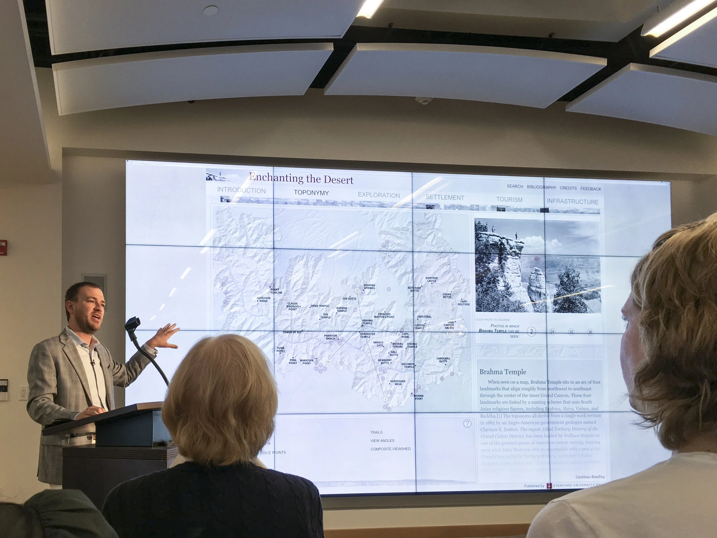
There was a public release event to announce the formal publication of the project. I gave a live demonstration and lecture about the process. It was the end of over 4 years of work, and was an emotional and relieving day!
The publication was handed over to Stanford University Press, who maintains and publicizes the project in perpetuity.